React-Bootstrap causing margins on left and right side

I'm using React-Bootstrap in my React app. It is causing margin on the left and right side. I'm using the following code:
import React, { Component } from "react";
import "react-bootstrap/dist/react-bootstrap.min.js";
import "bootstrap/dist/css/bootstrap.min.css";
import { Grid, Row, Col } from "react-bootstrap";
import MuiThemeProvider from "material-ui/styles/MuiThemeProvider";
import AppBar from "material-ui/AppBar";

<Grid fluid>
   <Row>
      <Col xs={12} md={12}>
        <AppBar title="Title"
         iconClassNameRight="muidocs-icon-navigation-expand-more"/>
       </Col>
   </Row>
   <Row>
       <Col xs={4} md={4}>
          <h1>Hello</h1>
       </Col>
       <Col xs={8} md={8} >
          <h1>Hello World!</h1>
       </Col>
   </Row>
</Grid>
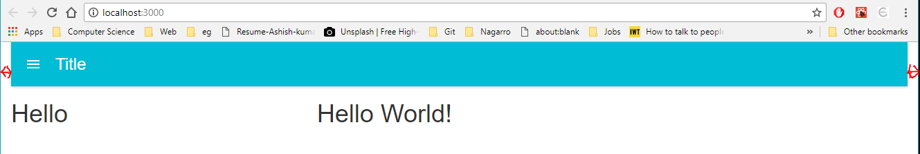
I'm getting the following output:
If I remove xs and md from <Col> then the issue gets fixed.
Importing twitter-bootstrap is causing this issue. If I remove the twitter-bootstrap import then the bootstrap styling doesn't work.
This issue is same as Twitter-Bootstrap's issue, but I'm not able to fix it in React-Bootstrap.
Answer

I tested your code with a clean react app. The previous suggestions were wrong. You need to set Grid components padding-left and padding-right to 0.
UPDATE: Just setting Grid is not enough. Also need to set margins to 0 of Row and paddings to 0 of Col.
You can achieve this by 3 ways.
1. Way: Add inline style for Grid, Row and Col
<Grid fluid style={{ paddingLeft: 0, paddingRight: 0 }}>
    <Row style={{ margin-left: 0, margin-right: 0 }}>
        <Col style={{ padding-left: 0, padding-right: 0 }}>
            ...
        </Col>
    </Row>
</Grid>
OR
const styles = {
    grid: {
        paddingLeft: 0,
        paddingRight: 0
    },
    row: {
        marginLeft: 0,
        marginRight: 0
    },
    col: {
        paddingLeft: 0,
        paddingRight: 0
    }
};
<Grid fluid style={styles.grid}>
    <Row style={styles.row}>
        <Col style={styles.col}>
            ...
        </Col>
    </Row>
</Grid>
2. WAY: Add a custom class name
//App.css
div.noPadding {
    padding-left: 0;
    padding-right: 0;
}

div.noMargin {
    margin-left: 0;
    margin-right: 0;
}

//App.js
import '/path/to/your/App.css';

render() {
    return (
        <Grid fluid className="noPadding">
            <Row className="noMargin">
                <Col className="noPadding">
                    ...
                </Col>
            </Row>
        </Grid>
    )
}
3. WAY You can globally change Grid, Row and Col components behaviour by overriding components className
//App.css

div.container-fluid {
    padding-left: 0;
    padding-right: 0;
}

div.row {
    margin-right: 0px;
    margin-left: 0px
}

div.col-lg-1,div.col-lg-10,div.col-lg-11,div.col-lg-12,div.col-lg-2,div.col-lg-3,div.col-lg-4,div.col-lg-5,div.col-lg-6,div.col-lg-7,div.col-lg-8,div.col-lg-9,
div.col-md-1,div.col-md-10,div.col-md-11,div.col-md-12,div.col-md-2,div.col-md-3,div.col-md-4,div.col-md-5,div.col-md-6,div.col-md-7,div.col-md-8,div.col-md-9,
div.col-sm-1,div.col-sm-10,div.col-sm-11,div.col-sm-12,div.col-sm-2,div.col-sm-3,div.col-sm-4,div.col-sm-5,div.col-sm-6,div.col-sm-7,div.col-sm-8,div.col-sm-9,
div.col-xs-1,div.col-xs-10,div.col-xs-11,div.col-xs-12,div.col-xs-2,div.col-xs-3,div.col-xs-4,div.col-xs-5,div.col-xs-6,div.col-xs-7,div.col-xs-8,div.col-xs-9 {
    padding-left: 0;
    padding-right: 0;
}