Align the form to the center in Bootstrap 4

I am trying to align the form to the center and keep it responsive. I have tried several ways but no success. I am trying to center all the text and the form. I am using Bootstrap v4. I am not sure if that helps.
HTML:
<section id="cover">
<div id="cover-caption">
<div id="container">
<div class="col-sm-10 col-sm offset-1">
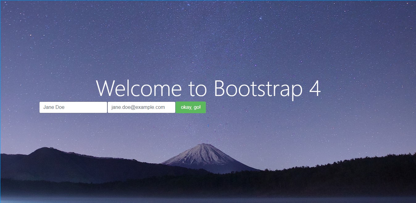
<h1 class="display-3">Welcome to Bootstrap 4</h1>
<div class="info-form">
<form action="" class="form-inline">
<div class="form-group">
<label class="sr-only">Name</label>
<input type="text" class="form-control" placeholder="Jane Doe">
</div>
<div class="form-group">
<label class="sr-only">Email</label>
<input type="text" class="form-control" placeholder="[email protected]">
</div>
<button type="submit" class="btn btn-success ">okay, go!</button>
</form>
</div>
<br>
<a href="#nav-main" class="btn btn-secondary-outline btn-sm" role="button">↓</a>
</div>
</div>
</div>
</section>
CSS:
html,
body{
 height: 100%;
}

#cover {
  background: #222 url('../img/stars.jpg') center center no-repeat;
  background-size: cover;
  color: white;
  height: 100%;
  text-align: center;
  display: flex;
  align-items: center;
}
#cover-caption {
  width: 100%;
}
Answer

You need to use the various Bootstrap 4 centering methods...
- Use
text-centerfor inline elements. - Use
justify-content-centerfor flexbox elements (ie;form-inline)
https://www.codeply.com/go/Am5LvvjTxC
Also, to offset the column, the col-sm-* must be contained within a .row, and the .row must be in a container...
<section id="cover">
    <div id="cover-caption">
        <div id="container" class="container">
            <div class="row">
                <div class="col-sm-10 offset-sm-1 text-center">
                    <h1 class="display-3">Welcome to Bootstrap 4</h1>
                    <div class="info-form">
                        <form action="" class="form-inline justify-content-center">
                            <div class="form-group">
                                <label class="sr-only">Name</label>
                                <input type="text" class="form-control" placeholder="Jane Doe">
                            </div>
                            <div class="form-group">
                                <label class="sr-only">Email</label>
                                <input type="text" class="form-control" placeholder="[email protected]">
                            </div>
                            <button type="submit" class="btn btn-success ">okay, go!</button>
                        </form>
                    </div>
                    <br>

                    <a href="#nav-main" class="btn btn-secondary-outline btn-sm" role="button">↓</a>
                </div>
            </div>
        </div>
    </div>
</section>