Bootstrap 4 - Responsive cards in card-columns

I'm playing with Bootstrap 4 and I can't find a solution to add responsiveness to cards while in a div with class="card-columns" (this class applies a Masonry-like effect to the cards inside the div having this class).
In Bootstrap 3 it was easy to style and make "cards" responsive since it was possible to apply something like class="col-md-3 col-sm-6 col-xs-12" to a div containing thumbnail, caption, etc.
How to have the same effect while using cards in Bootstrap 4?
Here is the HTML:
<body>

<div class="container-fluid">
    <div class="row">

        <div class="col-md-4 hidden-sm-down" id="map_container">
            <p>here we put the map</p>
        </div>

        <div class="col-md-8 col-sm-12 right_box">

            <div class="row">

                // here there's code for navbar

            </div><!-- row -->

            <div class=row">
                <div class="card-columns">
                    <?php
                    // Create and check connection

                    if ($result->num_rows > 0) {

                        // output card design
                        while($row = $result->fetch_assoc()) {

                            echo '<div class="card">
                                    <img class="card-img-top" src="dance' . $row["id"] . '.jpg" alt="' . $row["name"] . '">
                                    <div class="card-block">
                                        <h4 class="card-title">' . $row["name"] . '</h4>
                                        <p class="card-text">Text. Card content.</p>
                                    </div>
                                    <div class="card-footer text-muted">
                                        <ul class="list-inline">
                                            <li><i class="fa fa-user"></i></li>
                                            <li>14</li>
                                        </ul>
                                    </div>
                                  </div><!-- card -->';
                        }
                    } else {
                        echo "0 results";
                    }

                    $conn->close();
                    ?>
                </div><!-- container card-columns -->
            </div><!-- row -->
        </div><!-- col-md-8 right_box -->
    </div><!-- row -->
</div><!-- container-fluid -->
</body>
And here is the CSS I've used:
#map_container {
background-image: url(map.png);
height: 100vh;
}

.right_box {
-webkit-box-shadow: -2px 0px 2px 0px rgba(0,0,0,0.75);
-moz-box-shadow: -2px 0px 2px 0px rgba(0,0,0,0.75);
box-shadow: -2px 0px 2px 0px rgba(0,0,0,0.75);
}

.card {
border-radius: 0 !important;
border: 0 none;
-webkit-box-shadow: 0px 2px 5px 0px rgba(0,0,0,0.5);
-moz-box-shadow: 0px 2px 5px 0px rgba(0,0,0,0.5);
box-shadow: 0px 2px 5px 0px rgba(0,0,0,0.5);
margin-left: 1px;
margin-right: 1px;
}

.card-img-top {
width: 100%;
border-radius: 0 !important;
}

.card-columns {
padding-top: 15px;
}
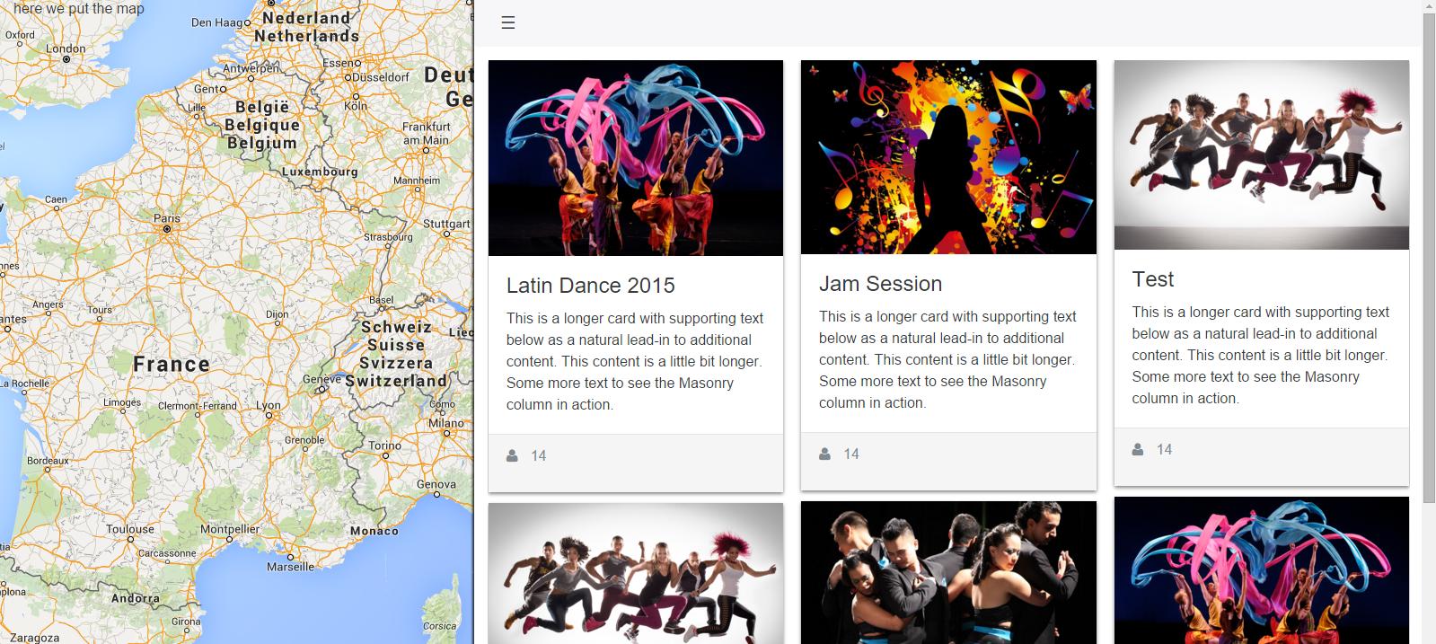
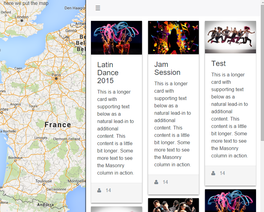
Given below are two images to make my situation clearer:
I'd like cards to stack up vertically on smaller screens.
Thanks for your suggestions!
Answer

Update 2019 - Bootstrap 4
You can simply use the SASS mixin to change the number of cards across in each breakpoint / grid tier.
.card-columns {
  @include media-breakpoint-only(xl) {
    column-count: 5;
  }
  @include media-breakpoint-only(lg) {
    column-count: 4;
  }
  @include media-breakpoint-only(md) {
    column-count: 3;
  }
  @include media-breakpoint-only(sm) {
    column-count: 2;
  }
}
SASS Demo: http://www.codeply.com/go/FPBCQ7sOjX
Or, CSS only like this...
@media (min-width: 576px) {
    .card-columns {
        column-count: 2;
    }
}

@media (min-width: 768px) {
    .card-columns {
        column-count: 3;
    }
}

@media (min-width: 992px) {
    .card-columns {
        column-count: 4;
    }
}

@media (min-width: 1200px) {
    .card-columns {
        column-count: 5;
    }
}
CSS-only Demo: https://www.codeply.com/go/FIqYTyyWWZ