CSS Skew only container, not content

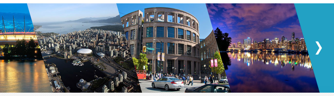
I'm having trouble figuring out how to make the following layout work. I'm not restricted to pure CSS - I know JS will be involved to make it cross-browser - but a CSS solution would be awesome. Here's what I am trying to achieve:
I've tried the following code, skewing the container and then skewing the image in the opposite direction, but it just gives me a square image. Chrome inspector shows me that the container is being skewed properly, but skewing the image back makes it square again. Adding an overflow:hidden to the container kind of works but the edges of the angle become jagged. Here's what I have tried:
http://codepen.io/anon/pen/ubrFz
Please help! :)
Answer

Need to tweak the positioning and the size of the container so you can crop it, and apply the backface-visibility rule:
.skew {
    -webkit-backface-visibility : hidden; /* the magic ingredient */
    -webkit-transform           : skew(16deg, 0);
    overflow                    : hidden;
    width                       : 300px;
    height                      : 260px;
    position                    : relative;
    left                        : 50px;
    border                      : 1px solid #666
}

.skew img {
    -webkit-transform : skew(-16deg, 0);
    position          : relative;
    left              : -40px;
}
http://codepen.io/anon/pen/HLtlG <- before (aliased)
http://codepen.io/anon/pen/wnlpt <- after (anti-aliased)