How to make TextInputLayout hint asterisk red for required fields

Is it possible to make just the asterisk in the hint red when using a TextInputLayout from the design support library? I have seen information on styling the entire hint, but this is a little more complex since only the * should be red, not the whole message.
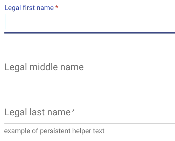
The Material Design example shows this, but the design library doesn't seem to have any option to style it this way using a TextInputLayout and EditText.
Reference: https://www.google.com/design/spec/components/text-fields.html#text-fields-required-fields
Example (the top, with focus, has the red asterisk; the bottom without focus does not have a red asterisk):
I looked into setting the hint to a SpannableString (see here How to get a red asterisk in a <string> entry) in an OnFocusChangeListener (see here Having the mandatory symbol to the edit text (red color asterisk) which is inside the textinputlayout), but the hint is a CharSequence.
Is there any way to do this without extending TextInputLayout?
Answer

Material Design specify an asterisk for the required fields that is part of the hint text, and of the same color (not in red like you showed in your question).
In Kotlin this is really simple:
1.Define this extension method:
fun TextInputLayout.markRequired() {
    hint = "$hint *"
}
2.Use it:
input_first_name.markRequired()
If you still want the asterisk red, despite being discouraged by Material Design guidelines, you can use AndroidX Core KTX that way:
fun TextInputLayout.markRequiredInRed() {
    hint = buildSpannedString {
        append(hint)
        color(Color.RED) { append(" *") } // Mind the space prefix.
    }
}