How do I customize the WPF StatusBar layout?

Adding more than one child to a WPF StatusBar results in poor layout with little option to customize. For example, this code:
<Window x:Class="StatusBar.MainWindow"
        xmlns="http://schemas.microsoft.com/winfx/2006/xaml/presentation"
        xmlns:x="http://schemas.microsoft.com/winfx/2006/xaml"
        Title="MainWindow" Height="350" Width="525">
    <DockPanel>
        <StatusBar DockPanel.Dock="Bottom">
            <StatusBarItem>
                <TextBlock>Ready</TextBlock>
            </StatusBarItem>
            <StatusBarItem>
                <TextBlock>Set</TextBlock>
            </StatusBarItem>
        </StatusBar>

        <Label>Main Content</Label>
    </DockPanel>
</Window>
Results in:
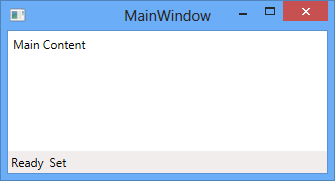
This is not the ideal layout, since the "Set" is squeezed right up against the "Ready".
How do I gain full control over the layout of the WPF StatusBar control?
Answer
By default, the StatusBar uses a DockPanel to position its children. This works fine for one item, but tends to make things messy and inconvenient when working with more than one child.
To gain a high level of control over the positioning of status bar children, you can swap out the DockPanel for a Grid:
<Window x:Class="StatusBar.MainWindow"
        xmlns="http://schemas.microsoft.com/winfx/2006/xaml/presentation"
        xmlns:x="http://schemas.microsoft.com/winfx/2006/xaml"
        Title="MainWindow" Height="350" Width="525">
    <DockPanel>
        <StatusBar DockPanel.Dock="Bottom">
            <StatusBar.ItemsPanel>
                <ItemsPanelTemplate>
                    <Grid>
                        <Grid.RowDefinitions>
                            <RowDefinition Height="*"/>
                        </Grid.RowDefinitions>
                        <Grid.ColumnDefinitions>
                            <ColumnDefinition Width="4*"/>
                            <ColumnDefinition Width="Auto"/>
                            <ColumnDefinition Width="*"/>
                            <ColumnDefinition Width="*"/>
                        </Grid.ColumnDefinitions>
                    </Grid>
                </ItemsPanelTemplate>
            </StatusBar.ItemsPanel>
            <StatusBarItem>
                <TextBlock>Ready</TextBlock>
            </StatusBarItem>
            <StatusBarItem Grid.Column="1">
                <ProgressBar Value="30" Width="80" Height="18"/>
            </StatusBarItem>
            <StatusBarItem Grid.Column="2">
                <TextBlock>Set</TextBlock>
            </StatusBarItem>
            <StatusBarItem Grid.Column="3">
                <TextBlock>Go!</TextBlock>
            </StatusBarItem>
        </StatusBar>

        <Label>Main Content</Label>
    </DockPanel>
</Window>
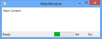
This results in:
For a more in-depth discussion, please visit my blog post here.