Bootstrap full responsive navbar with logo or brand name text

I would like to do a full responsive navbar with specified height in Twitter Bootstrap 3.1.1, where the brand could consists of image (logo) or text.
html:
<nav class="navbar navbar-inverse navbar-fixed-top" role="navigation">
    <div class="container">

        <div class="navbar-header">
            <button type="button" class="navbar-toggle" data-toggle="collapse"
                    data-target="#bs-example-navbar-collapse-1">

                <span class="sr-only">Toggle navigation</span>
                <span class="icon-bar"></span>
                <span class="icon-bar"></span>
                <span class="icon-bar"></span>

            </button>
            <a class="navbar-brand" href="#">
                <img src="http://placehold.it/150x50&text=Logo" alt="">
            </a>
        </div>

        <div class="collapse navbar-collapse" id="bs-example-navbar-collapse-1">
            <ul class="nav navbar-nav navbar-right">
                <li><a href="#">About</a></li>
                <li><a href="#">Services</a></li>
                <li><a href="#">Contact</a></li>
            </ul>
        </div>
    </div>
</nav>
css:
body {
    margin-top: 125px;
}

.navbar-fixed-top .nav {
    padding: 15px 0;
}
The problem is that after the browser's window size is decreased and menu is collapsed, navbar returns to its original height and logo image is as below:


The other problem is that changing <img src="http://placehold.it/150x50&text=Logo" alt=""> into <h3>AppName</h3> makes that AppName is not in the middle:
Currently it is centered by setting padding values, but I do not know how to make it independent from it.
Does anyone could help me solve this problem?
Regards
EDIT:
Here are prepared images of effect that I want to achieve:
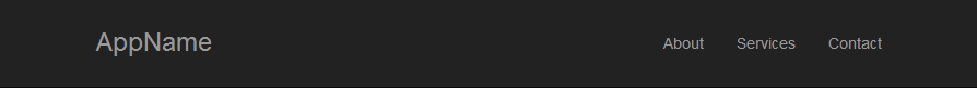
not collapsed navbar with logo image:
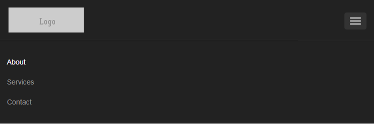
collapsed navbar (the same height of navbar, the same size of image, but different width od navbar):
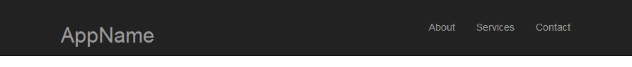
not collapsed navbar with brand name text:
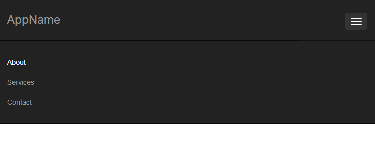
collapsed navbar (everything is the same except width of navbar caused by changing browser's window width):
Answer

If you want to achieve this (you can resize the window to see how it will look for mobile version), all you have to do is to have 2 logo images (1 for desktop and one for mobile) and display them depending of the enviroment using visible-xs and hidden-xs classes.
So i used something like this:
<img class="hidden-xs" src="http://placehold.it/150x50&text=Logo" alt="">
<img class="visible-xs" src="http://placehold.it/120x40&text=Logo" alt="">
And ofcourse, i styled the mobile logo using:
@media (max-width: 767px) {
    .navbar-brand {
        padding: 0;
    }

    .navbar-brand img {
        margin-top: 5px;
        margin-left: 5px;
    }
}
You can see all the code here. In case you need a text on mobile version insted of the logo, it's not a big deal. Just replace the logo with a <h1 class="visible-xs">AppName</h3> and change the style inside the media query like this:
@media (max-width: 767px) {
    .navbar-brand {
        padding: 0;
    }

    .navbar-brand h1{
        //here add your style depending of the position you want the text to be placed
    }
}
EDIT:
You need this conditions to make it work:
.navbar-toggle {
   margin: 23px 0;
}

.navbar-nav, .navbar-nav li, .navbar-nav li a {
  height: 80px;
  line-height: 80px;
}

.navbar-nav li a {
  padding-top: 0;
  padding-bottom:0;
}