Twitter Bootstrap 3.0 how do I "badge badge-important" now

In version two I could use
badge badge-important
I see that the .badge element no longer has contextual (-success,-primary,etc..) classes.
How do i achieve the same thing in version 3?
Eg. I want warning badges and important badges in my UI
Answer

Just add this one-line class in your CSS, and use the bootstrap label component.
.label-as-badge {
    border-radius: 1em;
}
Compare this label and badge side by side:
<span class="label label-default label-as-badge">hello</span>
<span class="badge">world</span>

They appear the same. But in the CSS, label uses em so it scales nicely, and it still has all the "-color" classes. So the label will scale to bigger font sizes better, and can be colored with label-success, label-warning, etc. Here are two examples:
<span class="label label-success label-as-badge">Yay! Rah!</span>

Or where things are bigger:
<div style="font-size: 36px"><!-- pretend an enclosing class has big font size -->
    <span class="label label-success label-as-badge">Yay! Rah!</span>
</div>

11/16/2015: Looking at how we'll do this in Bootstrap 4
Looks like .badge classes are completely gone. But there's a built-in .label-pill class (here) that looks like what we want.
.label-pill {
  padding-right: .6em;
  padding-left: .6em;
  border-radius: 10rem;
}
In use it looks like this:
<span class="label label-pill label-default">Default</span>
<span class="label label-pill label-primary">Primary</span>
<span class="label label-pill label-success">Success</span>
<span class="label label-pill label-info">Info</span>
<span class="label label-pill label-warning">Warning</span>
<span class="label label-pill label-danger">Danger</span>

11/04/2014: Here's an update on why cross-pollinating alert classes with .badge is not so great. I think this picture sums it up:
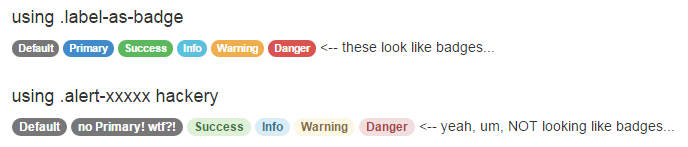
Those alert classes were not designed to go with badges. It renders them with a "hint" of the intended colors, but in the end consistency is thrown out the window and readability is questionable. Those alert-hacked badges are not visually cohesive.
The .label-as-badge solution is only extending the bootstrap design. We are keeping intact all the decision making made by the bootstrap designers, namely the consideration they gave for readability and cohesion across all the possible colors, as well as the color choices themselves. The .label-as-badge class only adds rounded corners, and nothing else. There are no color definitions introduced. Thus, a single line of CSS.
Yep, it is easier to just hack away and drop in those .alert-xxxxx classes -- you don't have to add any lines of CSS. Or you could care more about the little things and add one line.