Simple Materialize UI Responsive Side Menu

I've searched high and low for the Materialize UI equivalent of this (example in lighter weight MUI CSS): -
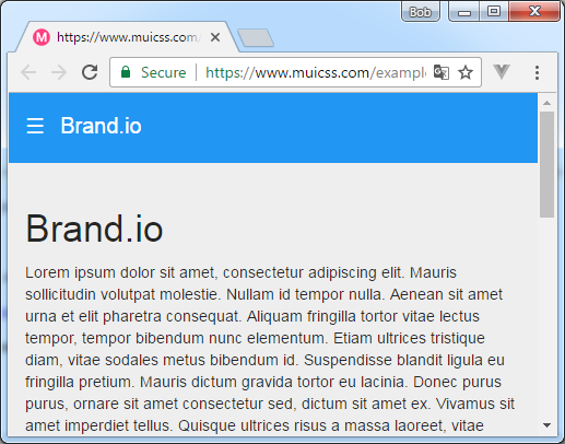
https://www.muicss.com/docs/v1/example-layouts/responsive-side-menu
For example on a desktop sould look like this (with ability to show / hide menu via burger icon): -

But on a mobile would look like this: -
Answer
I kept at it and came up with something using the documentation (http://materializecss.com/side-nav.html).
I've attached the HTML, CSS + JavaScript below if anyone is interested.
NOTE: In my answer there is no burger when viewed at a desktop size i.e. no ability to hide the menu. I discovered that if I removed the hide-on-large-only attribute on the following <a> then it put a menu over the top of the existing menu.
<a href="#" data-activates="slide-out" class="button-collapse hide-on-large-only"><i class="material-icons">menu</i></a>
Also, when clicking out of the menu it disappeared completely! :-)
Ideally it would be nice to have the burger in the desktop size so the menu can be hidnen if necessary but happy enough with this solution TBH.
$('.button-collapse').sideNav({
  menuWidth: 300, // Default is 300
  edge: 'left', // Choose the horizontal origin
  closeOnClick: false, // Closes side-nav on <a> clicks, useful for Angular/Meteor
  draggable: true // Choose whether you can drag to open on touch screens
});
#container {
padding-left: 300px;
}
#content {
padding: 20px;
}
@media only screen and (max-width : 992px) {
#container {
padding-left: 0px;
}
}<!-- JQuery / Materialize CSS + JavaScript imports -->
<link href="https://cdnjs.cloudflare.com/ajax/libs/materialize/0.98.0/css/materialize.min.css" rel="stylesheet" />
<link href="https://fonts.googleapis.com/icon?family=Material+Icons" rel="stylesheet" />
<script src="https://ajax.googleapis.com/ajax/libs/jquery/2.1.1/jquery.min.js"></script>
<script src="https://cdnjs.cloudflare.com/ajax/libs/materialize/0.98.0/js/materialize.min.js"></script>
<!-- HTML -->
<div id="container">
<div id="menu">
<ul id="slide-out" class="side-nav fixed show-on-large-only">
<li><a href="#!">First Sidebar Link</a></li>
<li><a href="#!">Second Sidebar Link</a></li>
<li class="no-padding">
<ul class="collapsible collapsible-accordion">
<li>
<a class="collapsible-header">Dropdown<i class="material-icons">arrow_drop_down</i></a>
<div class="collapsible-body">
<ul>
<li><a href="#!">First</a></li>
<li><a href="#!">Second</a></li>
<li><a href="#!">Third</a></li>
<li><a href="#!">Fourth</a></li>
</ul>
</div>
</li>
</ul>
</li>
</ul>
</div>
<div id="content">
<a href="#" data-activates="slide-out" class="button-collapse hide-on-large-only"><i class="material-icons">menu</i></a>
<h3>Simple Materialize Responsive Side Menu</h3>
<p>Resize browser to see what it looks like in (a) brwoser (b) mobile devices</p>
</div>
</div>