Python amplitude spectrum plot

I have two lists of float values, one for time and other for voltage values taken from an oscilloscope (I assume). I have to draw an amplitude spectrum plot, but i'm not exactly sure what function I need to use and what parameters I need to give it, I tried fft(u), but it didn't work.
Any help is appreciated, let me know if you need more info.
Answer

Use numpy.
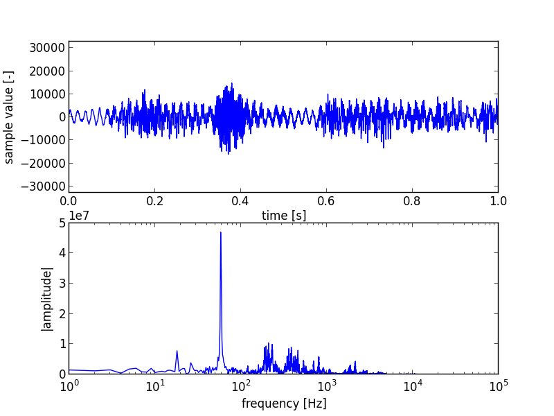
As an example, let me show how I analysed the frequencies in a stereo WAV file;
First I read the data and separated it in the left and right channels;
import wave
import numpy as np

wr = wave.open('input.wav', 'r')
sz = 44100 # Read and process 1 second at a time.
da = np.fromstring(wr.readframes(sz), dtype=np.int16)
left, right = da[0::2], da[1::2]
Next I run a discrete fourier transform on it;
lf, rf = abs(np.fft.rfft(left)), abs(np.fft.rfft(right))
And we plot the left channel with mathplotlib;
import matplotlib.pyplot as plt

plt.figure(1)
a = plt.subplot(211)
r = 2**16/2
a.set_ylim([-r, r])
a.set_xlabel('time [s]')
a.set_ylabel('sample value [-]')
x = np.arange(44100)/44100
plt.plot(x, left)
b = plt.subplot(212)
b.set_xscale('log')
b.set_xlabel('frequency [Hz]')
b.set_ylabel('|amplitude|')
plt.plot(lf)
plt.savefig('sample-graph.png')
The graph looks something like this;