iOS 8 removed "minimal-ui" viewport property, are there other "soft fullscreen" solutions?

(This is a multi-part question, I will try my best to summarise the scenario.)
We are currently building a responsive web app (news reader) that allow users to swipe between tabbed content, as well as scroll vertically inside each tabbed content.
A common approach to the problem is to have a wrapper div that fills the browser viewport, set overflow to hidden or auto, then scroll horizontally and/or vertically inside it.
This approach is great but has one main drawback: since the height of the document is exactly the same as the browser viewport, the mobile browser will not hide the address bar/navigation menu.
There are numerous hacks and viewport properties that enable us to get more screen real estate, but none are quite as effective as minimal-ui (introduced in iOS 7.1).
News came yesterday that iOS 8 beta4 had removed minimal-ui from Mobile Safari (see Webkit section in iOS 8 Release Notes), which left us wondering:
Q1. Is it still possible to hide the address bar on Mobile Safari?
As far as we know, iOS 7 no longer responds to the window.scrollTo hack, this suggests we have to live with the smaller screen space, unless we adopt a vertical layout or use mobile-web-app-capable.
Q2. Is it still possible to have a similar soft fullscreen experience?
By soft fullscreen I really mean without using the mobile-web-app-capable meta tag.
Our web app is built to be accessible, any page can be bookmarked or shared using the native browser menu. By adding mobile-web-app-capable we prevent users from invoking such menu (when it's saved to homescreen), which confuses and antagonises users.
minimal-ui used to be the middle-ground, hiding the menu by default but keeping it accessible with a tap -- though Apple might have removed it due to other accessibility concerns (such as users not knowing where to tap to activate the menu).
Q3. Is a fullscreen experience worth the trouble?
It would seem that a fullscreen API is not coming to iOS anytime soon, but even if it is, I don't see how the menu will be kept accessible (same goes for Chrome on Android).
In this case, maybe we should just leave mobile safari as it is, and account for viewport height (for iPhone 5+, it's 460 = 568 - 108, where 108 includes the OS bar, address bar and navigation menu; for iPhone 4 or older, it's 372).
Would love to hear some alternatives (besides building a native app).
Answer

The minimal-ui viewport property is no longer supported in iOS 8. However, the minimal-ui itself is not gone. User can enter the minimal-ui with a "touch-drag down" gesture.
There are several pre-conditions and obstacles to manage the view state, e.g. for minimal-ui to work, there has to be enough content to enable user to scroll; for minimal-ui to persist, window scroll must be offset on page load and after orientation change. However, there is no way of calculating the dimensions of the minimal-ui using the screen variable, and thus no way of telling when user is in the minimal-ui in advance.
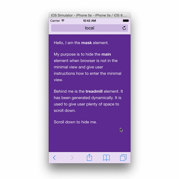
These observations is a result of research as part of developing Brim – view manager for iOS 8. The end implementation works in the following way:
When page is loaded, Brim will create a treadmill element. Treadmill element is used to give user space to scroll. Presence of the treadmill element ensures that user can enter the minimal-ui view and that it continues to persist if user reloads the page or changes device orientation. It is invisible to the user the entire time. This element has ID
brim-treadmill.Upon loading the page or after changing the orientation, Brim is using Scream to detect if page is in the minimal-ui view (page that has been previously in minimal-ui and has been reloaded will remain in the minimal-ui if content height is greater than the viewport height).
When page is in the minimal-ui, Brim will disable scrolling of the document (it does this in a safe way that does not affect the contents of the main element). Disabling document scrolling prevents accidentally leaving the minimal-ui when scrolling upwards. As per the original iOS 7.1 spec, tapping the top bar brings back the rest of the chrome.
The end result looks like this:
For the sake of documentation, and in case you prefer to write your own implementation, it is worth noting that you cannot use Scream to detect if device is in minimal-ui straight after the orientationchange event because window dimensions do not reflect the new orientation until the rotation animation has ended. You have to attach a listener to the orientationchangeend event.
Scream and orientationchangeend have been developed as part of this project.