How to set up different Auto Layout constraints for different screen sizes
I have a tableView with static cells. The cell contains an ImageView which fills it completely. And I have another smaller ImageViews atop. I position this ImageViews with constraints. I have a question about resizing the constraints. How can I set different constraint constants for different devices sizes without programming if/else loops. Is there a way to set it in the storyboard? I have a leading constraint to parent layout for example with an constant value of 10. This is okay for the iPhone 5 screen, but on an iPhone 6/ 6 plus screen it should be higher than 10.
iPhone5 Autolayout

iPhone6 Autolayout

Answer

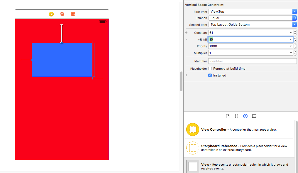
Very easy. You can change constants values for difference size classes in Storyboard. I am giving u a few steps after which you will be able to grasp it.
First we create constants as you can see on this view
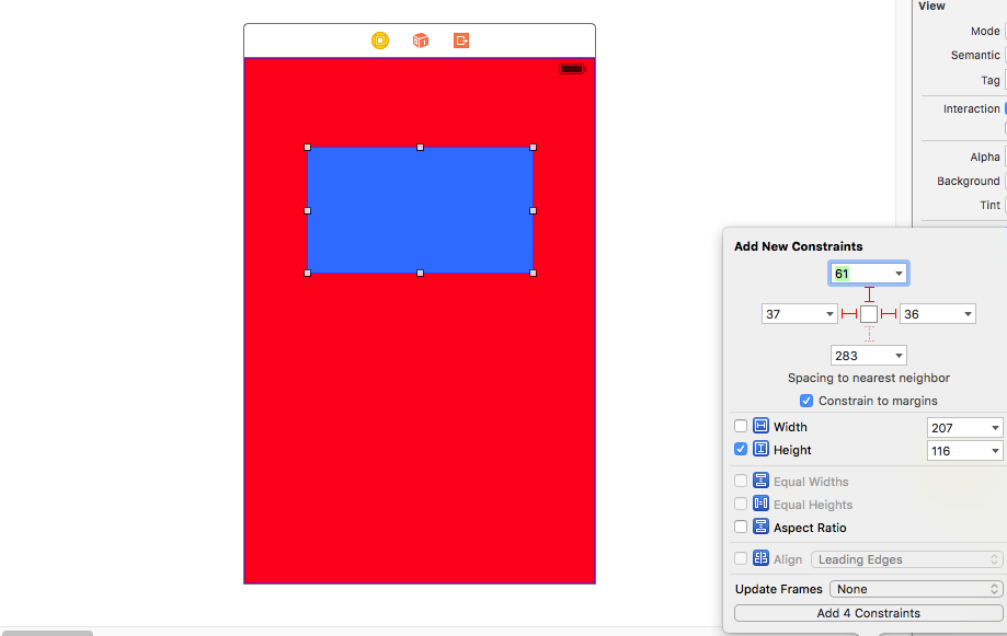
Next we select the constant we want to change the value in other size classes.
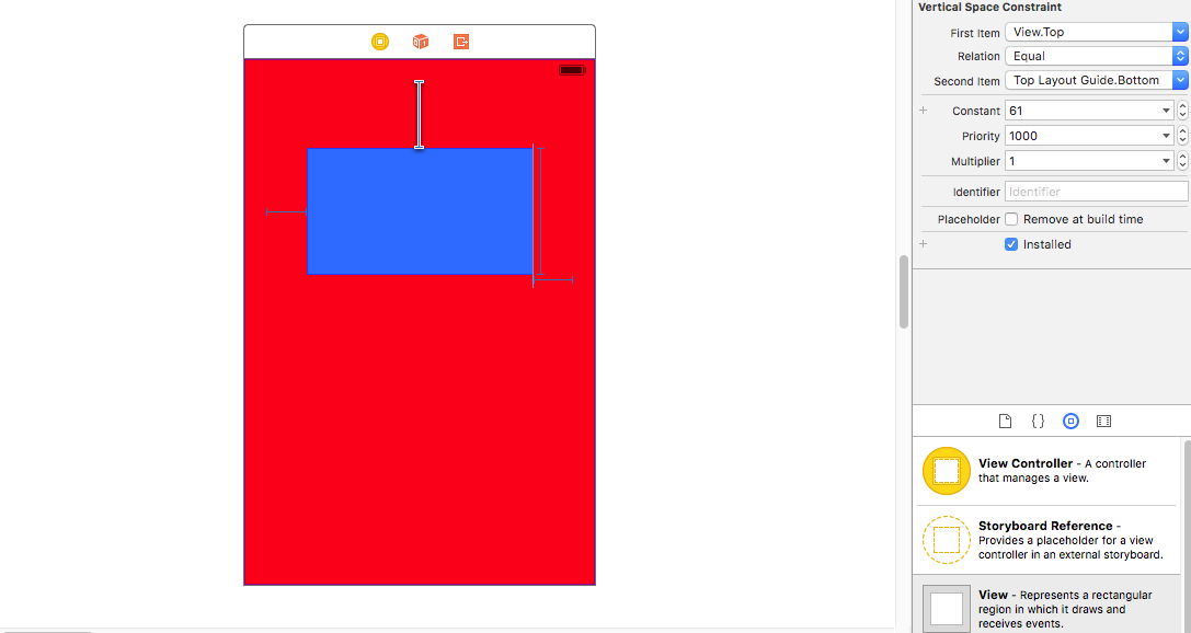
Now comes the tricky part. In the attribute inspector after selecting the constant, you can see the value of the constant. Right beside you can see the PLUS (+) sign, left of the "constant".
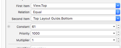
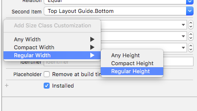
Click on it and select your size class that you want. Here i have selected Regular Height Regular Width i.e for iPad sizes.
Next we give it a new value. So the constant, which normally is of value 61, will function as 10 when rendered in a size class of iPad size classes.
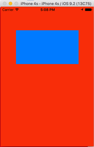
Here is the output --
iPhone 4:
iPad Air:
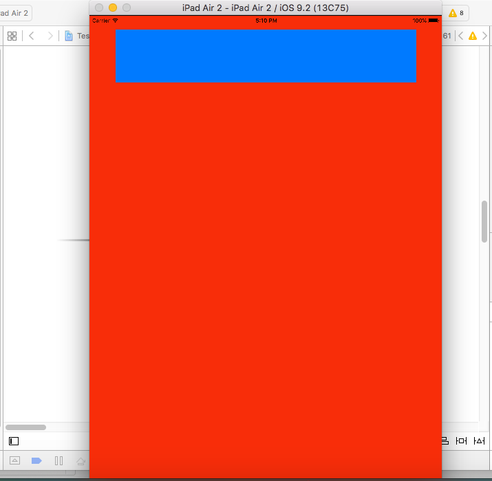
As you can see, the same constants has different value in runtime corresponding to different size classes.
Hope my explanation helped you.