How can I make a CSS glass/blur effect work for an overlay?

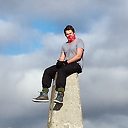
I am having trouble applying a blur effect on a semi-transparent overlay div. I'd like everything behind the div the be blurred, like this:

Here is a jsfiddle which doesn't work: http://jsfiddle.net/u2y2091z/
Any ideas how to make this work? I'd like to keep this as uncomplicated as possible and have it be cross-browser. Here is the CSS I'm using:
#overlay {
    position: absolute;
    left: 0;
    top: 0;
    right: 0;
    bottom: 0;

    background:black;
    background:rgba(0,0,0,0.8);

    filter:blur(4px);
    -o-filter:blur(4px);
    -ms-filter:blur(4px);
    -moz-filter:blur(4px);
    -webkit-filter:blur(4px);
}
Answer
For a more simple and up to date answer:
backdrop-filter: blur(6px);
Note browser support is not perfect but in most cases a blur would be non essential.