How to create a frosted glass effect using CSS?

I'd like to create a div that is fixed in one position and make it translucent - making the contents behind it partially visible and blurred. The style I'm looking for is similar to the div of the 'See All' thumbnails in the Apple website.
The only thing I can do is adjust opacity: 0.9 but I cannot blur the contents that go under the div.
Note: The div has a fixed position and the background scrolls. The background that scolls is a mix of text and photos.
Answer

CSS
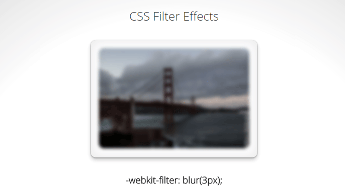
CSS 3 has a blur filter (only webkit at the moment Nov 2014):
-webkit-filter: blur(3px); /*chrome (android), safari (ios), opera*/
IE 4-9 supports a non-standard filter
filter:progid:DXImageTransform.Microsoft.Blur(PixelRadius='3')
See some nice demo for the blur and other filters here.
For future reference here is the compatibility table for CSS filter. Firefox seems to be getting the feature in v35+ while even IE11 does not seem to have any compatibility.
SVG
An alternative is using svg (safe for basically IE9 and up):
filter: url(blur.svg#blur);
SVG:
<svg version="1.1" xmlns="http://www.w3.org/2000/svg">
   <filter id="blur">
       <feGaussianBlur stdDeviation="3" />
   </filter>
</svg>
Javascript
You will achieve the highest browser compatibility with javascript, but usually the slowest performance and added complexity to your js.
- http://www.blurjs.com/ (jquery plugin, canvas solution so IE9+, FF, Chrome support)
- http://nbartlomiej.github.io/foggy/ (jquery plugin IE8+, FF,Chrome support)