Vertically center two elements within a div

I am trying to vertically center two <p> elements.
I followed the tutorial at phrogz.net but still the elements get placed above the div, below the div, top-aligned within the div.
I would try something else but most of the questions here just point back to that tutorial.
This snippet is for a banner that is on the top of a web page.
.banner {
  width: 980px;
  height: 69px;
  background-image: url(../images/nav-bg.jpg);
  background-repeat: no-repeat;
  /* color: #ffffff; */
}

.bannerleft {
  float: left;
  width: 420px;
  text-align: right;
  height: 652px;
  line-height: 52px;
  font-size: 28px;
  padding-right: 5px;
}

.bannerright {
  float: right;
  width: 555px;
  text-align: left;
  position: relative;
}

.bannerrightinner {
  position: absolute;
  top: 50%;
  height: 52px;
  margin-top: -26px;
}
<div class="banner">
<div class="bannerleft">
I am vertically centered
</div>
<div class="bannerright">
<div class="bannerrightinner">
<p>I should be</p>
<p>vertically centered</p>
</div>
</div>
<div class="clear">
</div>
</div>Answer

How to Center Elements Vertically, Horizontally or Both
Here are two ways to center divs within divs.
One way uses CSS Flexbox and the other way uses CSS table and positioning properties.
In both cases, the height of the centered divs can be variable, undefined, unknown, whatever. The height of the centered divs doesn't matter.
Here's the HTML for both:
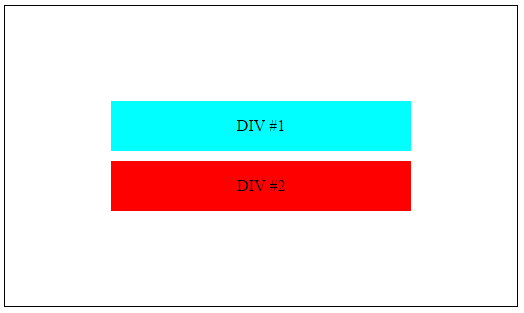
<div id="container">

    <div class="box" id="bluebox">
        <p>DIV #1</p>
    </div>

    <div class="box" id="redbox">
        <p>DIV #2</p>
    </div>

</div>
CSS Flexbox Method
#container {
    display: flex;              /* establish flex container */
    flex-direction: column;     /* stack flex items vertically */
    justify-content: center;    /* center items vertically, in this case */
    align-items: center;        /* center items horizontally, in this case */
    height: 300px;
    border: 1px solid black;
}

.box {
    width: 300px;
    margin: 5px;
    text-align: center;
}
The two child elements (.box) are aligned vertically with flex-direction: column. For horizontal alignment, switch the flex-direction to row (or simply remove the rule as flex-direction: row is the default setting). The items will remain centered vertically and horizontally (DEMO).
CSS Table and Positioning Method
body {
    display: table;
    position: absolute;
    height: 100%;
    width: 100%;
}

#container {
    display: table-cell;
    vertical-align: middle;
}

.box {
    width: 300px;
    padding: 5px;
    margin: 7px auto;
    text-align: center;
}
Which method to use...
If you're not sure which method to use, I would recommend flexbox for these reasons:
- minimal code; very efficient
- as noted above, centering is simple and easy (see another example)
- equal height columns are simple and easy
- multiple options for aligning flex elements
- it's responsive
- unlike floats and tables, which offer limited layout capacity because they were never intended for building layouts, flexbox is a modern (CSS3) technique with a broad range of options.
Browser support
Flexbox is supported by all major browsers, except IE < 10. Some recent browser versions, such as Safari 8 and IE10, require vendor prefixes. For a quick way to add prefixes use Autoprefixer. More details in this answer.