how to make padding responsive in mobile view?

I'm using wordpress and I used CSS to make the width of my 'About' and 'Contact' page more centered and smaller by adding padding. However, when I do this, in the mobile view especially (I think tablet is okay), there is white space on both sides because of it.
The theme that I am using is built like that I think and I could not really find something in that theme that makes the elements appear smaller width and centered on the page so I used padding instead to make it appear the way that I want.
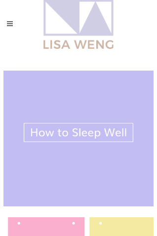
'Contact' page of my site in mobile view
'Portfolio' page of my site in mobile view
Here's a link to my website: http://www.lisaweng.com/contact/
Is there a CSS that makes those pages appear normal or full width when viewing on mobile view even if I add padding, like how the portfolio page views full width on mobile even though it has white space on both sides of the screen when viewed on the desktop version?
P.S. for the CSS for the padding of the 'About' and 'Contact' page elements, I did use percentages rather than pixels. I am not sure why it's not entirely responsive when viewed in mobile view.
Here's what my CSS looks like for the 'About' and 'Contact' page:
.cf7_custom_style_1 {
  padding-left: 20%;
  padding-right: 20%;
}
and
.aboutme {
  padding-left: 14%;
  padding-right: 14%;
}
Is there a code to fix this? Or any idea why this is the case? If there is a code for the mobile view fix, is it going to be the same for tablet as well or does the tablet also have a CSS to fix the responsiveness to how it should be?
Answer

Using @media queries to add breakpoints in CSS.
You need to utilise media queries within your CSS code to add specific breakpoints.
Adding this to your stylesheet may help:
@media only screen and (max-width: 950px) {
   .cf7_custom_style_1 {
      padding-left: 10%;
      padding-right: 10%;
   }
}

@media only screen and (max-width: 600px) {
   .cf7_custom_style_1 {
      padding-left: 0;
      padding-right: 0;
   }
}
Using the above code adds break-points at 950px and 600px. Meaning that if the window size = 950px, change this CSS class to these properties.