What is the meaning of xs, md, lg in CSS Flexbox system?

I'm developing an application using React and wanted to style components, I found https://roylee0704.github.io/react-flexbox-grid/ which talks about a fluid grid system. The example looks like:
<Row>
  <Col xs={12} sm={3} md={2} lg={1} />
  <Col xs={6} sm={6} md={8} lg={10} />
  <Col xs={6} sm={3} md={2} lg={1} />
</Row>
and I do not know what is xs, sm and lg is? Could someone please explain?
Answer

Let us assume that our screen is divided into 12 columns.
The xs part takes up when screen is extra small, Similarly small, medium and large classes as well, based on their respective screen size definition in CSS.
The example you provided:
<Row>
  <Col xs={12} sm={3} md={2} lg={1} />
  <Col xs={6} sm={6} md={8} lg={10} />
  <Col xs={6} sm={3} md={2} lg={1} />
</Row>
For our sake lets assume these three columns are named as col-1, col-2 and col-3
On an extra small screen:
col-1 takes up all the 12 columns and the rest two of them take 6 each(on a new row)
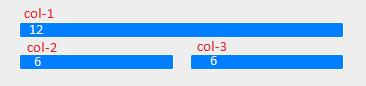
On small screens
col-1 and col-3 takes up 3, while the middle one col-2 takes 6
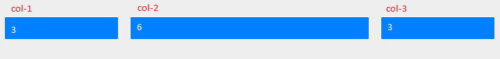
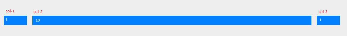
Similarly
Medium screens

Large screens
P.S. Images are screenshots of the link you provided (by resizing the browser for each screen size)