How to make a smooth dashed border rotation animation like 'marching ants'

I'm working on a css animation that uses 'cogs and chains', but am unable to create a 'smooth' border rotation sequence.
You can see in this fiddle How (currently) I'm using a pseudo element to generate a 'rotation' effect. This is done by 'switching' between a dashed white and dashed gold colored border, making it seem like the 'border is rotating'.
What I have
So, the lower section of the snippet, you can see how I've generated the 'rotating chain effect' through using keyframes.
What I would like
My overall wish would be to generate something like:
Think of a cross section of a conveyor belt, and how the 'gears at the end drive the belt'. I'm trying to reproduce that. (i.e. the dashed border's gold bits should be within the troughs of the gear, and 'be pulled' by it)
#one{
  -webkit-animation: rotateClockwiseAnimation 5s linear infinite; /* Safari 4+ */
  -moz-animation:    rotateClockwiseAnimation 5s linear infinite; /* Fx 5+ */
  -o-animation:      rotateClockwiseAnimation 5s linear infinite; /* Opera 12+ */
  animation:         rotateClockwiseAnimation 5s linear infinite; /* IE 10+, Fx 29+ */
border:5px dashed gold;
  border-radius:50%;
}

@-webkit-keyframes rotateClockwiseAnimation {
  0%   { transform: rotate(0deg); }
  100% { transform: rotate(360deg); }
}
@-moz-keyframes rotateClockwiseAnimation{
  0%   { transform: rotate(0deg); }
  100% { transform: rotate(360deg); }
}
@-o-keyframes rotateClockwiseAnimation {
  0%   { transform: rotate(0deg); }
  100% { transform: rotate(360deg); }
}
@keyframes rotateClockwiseAnimation {
  0%   { transform: rotate(0deg); }
  100% { transform: rotate(360deg); }
}
<svg id="one" style="width:50px" xmlns="http://www.w3.org/2000/svg" viewbox="0 0 100 100">
<defs>
<circle id="c" cx="50" cy="50" r="30" stroke="#808080" fill="none" stroke-width="25"/>
<path id="d" stroke="#808080" stroke-width="16" d="M50 0, V15 M50 100, V85 M0 50, H15 M100 50, H85"/>
</defs>
<use xlink:href="#c"/>
<use xlink:href="#d"/>
<use xlink:href="#d" transform="rotate(45, 50, 50)"/>
</svg>but with the gold dashes to fit within the gear's troughs, as well as being 80% width of the screen (if that makes sense).
In the end, I would like to generate something like this image portrays:
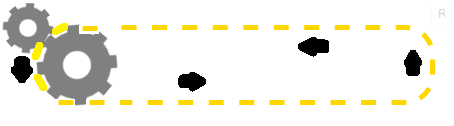
See how i want the chain to 'rotate'?
My Current Issues
- Since the animation is 'hacked' via the use of a pseudo element, I've found it quite hard to actually sync the rotation of this 'chain'.
- I'm still learning keyframe animation, so I'm sure that isn't the best method for this
- Again, svg is a new concept for me, so bear with my reluctance to use it (hence why I'm using css for the 'chain')
- In the end, I want to 'make it look like' the gear is turning the chain, but right now they look like completely (and badly done) separate element animations
Answer

Cog and chain animation :
I totaly refactored the code (CSS and HTML), it is now :
- shorter (especialy the css)
- simpler
- more realistic: corrected the synchronisation issue bteween the chain and the cogs and added a missing cog on the right because your chain seemed to be floating in the air :
The approach is the same, animating the rotation angle for the cogs and dash-offset for the chain path. I tweaked the timing between both animations to make it look as if the cogs are pulling the chain.
Browser support :
As IE doesn't support the svg animate element I also made this version of the animation with the snap.svg library that also supports IE9 and over (tested in IE9 with crossbrowsertesting).
DEMO with IE support
var cont   = new Snap('#svg'),
    chain  = cont.select('#chain'),
    cogAcw = cont.select('#cog_acw'),
    cogCw  = cont.select('#cog_cw'),
    speed  = 500;  // Lower this number to make the animation faster

function infChain(el) {
    var len = el.getTotalLength();
    el.attr({"stroke-dasharray": len/62,"stroke-dashoffset": 0});
    el.animate({"stroke-dashoffset": -len/31}, speed, mina.linear, infChain.bind(null, el));
}
function rotateAcw(el) {
    el.transform('r22.5,20,20');
    el.animate({ transform: 'r-22.5,20,20' }, speed, mina.linear, rotateAcw.bind( null, el));
}
function rotateCw(el) {
    el.transform('r0,20,20');
    el.animate({ transform: 'r45,20,20' }, speed, mina.linear, rotateCw.bind( null, el));
}
infChain(chain);
rotateAcw(cogAcw);
rotateCw(cogCw);
svg {
width:100%;
}<script src="http://thisisa.simple-url.com/js/snapsvg.js"></script>
<svg id="svg" xmlns="http://www.w3.org/2000/svg" viewbox="0 0 100 30">
<defs>
<circle id="c" cx="20" cy="20" r="4" stroke="#808080" fill="none" stroke-width="4" />
<path id="d" stroke="#808080" stroke-width="2" d="M20 13 V16 M27 20 H24 M20 27 V24 M13 20 H16" />
<g id="cog_acw">
<use xlink:href="#c" /><use xlink:href="#d" />
<use xlink:href="#d" transform="rotate(45 20 20)" />
</g>
<g id="cog_cw">
<use xlink:href="#c" /><use xlink:href="#d" />
<use xlink:href="#d" transform="rotate(45 20 20)" />
</g>
</defs>
<path id="chain" stroke-width="1" stroke="#000" fill="transparent"
d="M21.3 13.5 H20 C11.4 13.5 11.4 26.5 20 26.5 H80 C89.4 26.5 89.4 13.5 80.8 13.5z" />
<use xlink:href="#cog_acw" />
<use transform="translate(60.5 0), rotate(19,20,20)" xlink:href="#cog_acw" />
<use transform="translate(-4.5 -4.5),scale(.8), rotate(0,20,20)" xlink:href="#cog_cw" />
</svg>svg{width:100%;}
#chain_st{
-webkit-animation: dash 1s infinite linear;
-moz-animation: dash 1s infinite linear;
-o-animation: dash 1s infinite linear;
animation: dash 1s infinite linear;
}
@-webkit-keyframes dash {
to { stroke-dashoffset: -5; }
}
@-moz-keyframes dash {
to { stroke-dashoffset: -5; }
}
@-o-keyframes dash {
to { stroke-dashoffset: -5; }
}
@keyframes dash {
to { stroke-dashoffset: -5; }
}<svg id="one" xmlns="http://www.w3.org/2000/svg" viewbox="0 0 100 30">
<defs>
<circle id="c" cx="20" cy="20" r="4" stroke="#808080" fill="none" stroke-width="4"/>
<path id="d" stroke="#808080" stroke-width="2" d="M20 13 V16 M27 20 H24 M20 27 V24 M13 20 H16"/>
<g id="cog">
<use xlink:href="#c"/>
<use xlink:href="#d"/>
<use xlink:href="#d" transform="rotate(45 20 20)"/>
</g>
</defs>
<g transform="translate(0,-7), scale(0.8), rotate(22.5 8 8)">
<use xlink:href="#cog">
<animateTransform attributeType="xml" attributeName="transform" type="rotate" from="-22.5 20 20" to="337.5 20 20" dur="8s" repeatCount="indefinite"/>
</use>
</g>
<path id="chain_st" stroke-width="1" stroke="#000" fill="transparent" stroke-dasharray="2.6 2.45" d="M21.3 13.5 H20 C11.4 13.5 11.4 26.5 20 26.5 H80 C89 26.5 89 13.5 80.8 13.5z" />
<use class="rot" xlink:href="#cog">
<animateTransform attributeType="xml" attributeName="transform" type="rotate"from="22.5 20 20" to="-337.5 20 20" dur="8s" repeatCount="indefinite"/>
</use>
<g transform="translate(60.3 0)">
<use class="" xlink:href="#cog">
<animateTransform attributeType="xml" attributeName="transform" type="rotate" from="22.5 20 20" to="-337.5 20 20" dur="8s" repeatCount="indefinite"/>
</use>
</g>
</svg>Original answer :
You could use an other svg dashed path and animate the dash-offset property with a keyframe animation.
This can and should be simplified/tweaked for a "real world" use :
- all elements can be contained into one
<svg>tag (this would make it simpler and both cogs + chain could resize together) - The sync between the chain and the cog isn't perfect and speed/size of chain needs to be tweaked.
#one {
  -webkit-animation: rotateClockwiseAnimation 5s linear infinite;
  /* Safari 4+ */
  -moz-animation: rotateClockwiseAnimation 5s linear infinite;
  /* Fx 5+ */
  -o-animation: rotateClockwiseAnimation 5s linear infinite;
  /* Opera 12+ */
  animation: rotateClockwiseAnimation 5s linear infinite;
  /* IE 10+, Fx 29+ */
}
#two {
  -webkit-animation: rotateAntiClockwiseAnimation 5s linear infinite;
  /* Safari 4+ */
  -moz-animation: rotateAntiClockwiseAnimation 5s linear infinite;
  /* Fx 5+ */
  -o-animation: rotateAntiClockwiseAnimation 5s linear infinite;
  /* Opera 12+ */
  animation: rotateAntiClockwiseAnimation 5s linear infinite;
  /* IE 10+, Fx 29+ */
  position: absolute;
  top: 30px;
  left: 42px;
  width: 80px;
}
@-webkit-keyframes rotateClockwiseAnimation {
  0% {
    transform: rotate(0deg);
  }
  100% {
    transform: rotate(360deg);
  }
}
@-moz-keyframes rotateClockwiseAnimation {
  0% {
    transform: rotate(0deg);
  }
  100% {
    transform: rotate(360deg);
  }
}
@-o-keyframes rotateClockwiseAnimation {
  0% {
    transform: rotate(0deg);
  }
  100% {
    transform: rotate(360deg);
  }
}
@keyframes rotateClockwiseAnimation {
  0% {
    transform: rotate(0deg);
  }
  100% {
    transform: rotate(360deg);
  }
}
@-webkit-keyframes rotateAntiClockwiseAnimation {
  0% {
    transform: rotate(0deg);
  }
  100% {
    transform: rotate(-360deg);
  }
}
@-moz-keyframes rotateAntiClockwiseAnimation {
  0% {
    transform: rotate(0deg);
  }
  100% {
    transform: rotate(-360deg);
  }
}
@-o-keyframes rotateAntiClockwiseAnimation {
  0% {
    transform: rotate(0deg);
  }
  100% {
    transform: rotate(-360deg);
  }
}
@keyframes rotateAntiClockwiseAnimation {
  0% {
    transform: rotate(0deg);
  }
  100% {
    transform: rotate(-360deg);
  }
}
/******************************************************************************/

#chain {
  width: 650px;
  position: absolute;
  top: 24px;
  left: 35px;
}
.chain_st {
  stroke-dasharray: 1.5;
  stroke-dashoffset: 10;
  -webkit-animation: dash 18s infinite linear;
  -moz-animation: dash 18s infinite linear;
  -o-animation: dash 18s infinite linear;
  animation: dash 18s infinite linear;
}
@-webkit-keyframes dash {
  to {
    stroke-dashoffset: 100;
  }
}
@-moz-keyframes dash {
  to {
    stroke-dashoffset: 100;
  }
}
@-o-keyframes dash {
  to {
    stroke-dashoffset: 100;
  }
}
keyframes dash {
  to {
    stroke-dashoffset: 100;
  }
}
<svg id="one" style="width:50px" xmlns="http://www.w3.org/2000/svg" viewbox="0 0 100 100">
<defs>
<circle id="c" cx="50" cy="50" r="30" stroke="#808080" fill="none" stroke-width="25" />
<path id="d" stroke="#808080" stroke-width="16" d="M50 0, V15 M50 100, V85 M0 50, H15 M100 50, H85" />
</defs>
<use xlink:href="#c" />
<use xlink:href="#d" />
<use xlink:href="#d" transform="rotate(45, 50, 50)" />
</svg>
<svg id="two" xmlns="http://www.w3.org/2000/svg" viewbox="0 0 100 100">
<use xlink:href="#one" />
</svg>
<svg id="chain" xmlns="http://www.w3.org/2000/svg" viewbox="0 0 70 10">
<path class="chain_st" stroke-width="0.5" stroke="#000" fill="transparent" d="M60 1 Q65 1 65 5 Q65 9 60 9 H6 Q1 9 1 5 Q1 1 6 1z" />
</svg>