Creating CSS3 Circles connected by lines

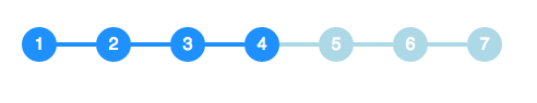
I have to implement the following circle and line combination in CSS and I am looking for pointers on how to implement this effectively. The circles and lines should look like this:

I am able to implement the circles as such:
span.step {
  background: #ccc;
  border-radius: 0.8em;
  -moz-border-radius: 0.8em;
  -webkit-border-radius: 0.8em;
  color: #1f79cd;
  display: inline-block;
  font-weight: bold;
  line-height: 1.6em;
  margin-right: 5px;
  text-align: center;
  width: 1.6em;
}
but the lines are tricky for me to understand.
The size of the circle changes depending on whether it is the active step or not, and the color of the line connecting the circles changes as well depending on status. How would I accomplish this?
Answer

You can achieve this effect with no additional markup using pseudo-elements and the adjacent sibling selector (~):
li {
  width: 2em;
  height: 2em;
  text-align: center;
  line-height: 2em;
  border-radius: 1em;
  background: dodgerblue;
  margin: 0 1em;
  display: inline-block;
  color: white;
  position: relative;
}

li::before{
  content: '';
  position: absolute;
  top: .9em;
  left: -4em;
  width: 4em;
  height: .2em;
  background: dodgerblue;
  z-index: -1;
}


li:first-child::before {
  display: none;
}

.active {
  background: dodgerblue;
}

.active ~ li {
  background: lightblue;
}

.active ~ li::before {
  background: lightblue;
}
<ul>
<li>1</li>
<li>2</li>
<li>3</li>
<li class="active">4</li>
<li>5</li>
<li>6</li>
<li>7</li>
</ul>