Linear fade out div, content and border (solid at top to transparent at bottom)

Possible Duplicate:
Is it possible to graduate the opacity of an HTML element?
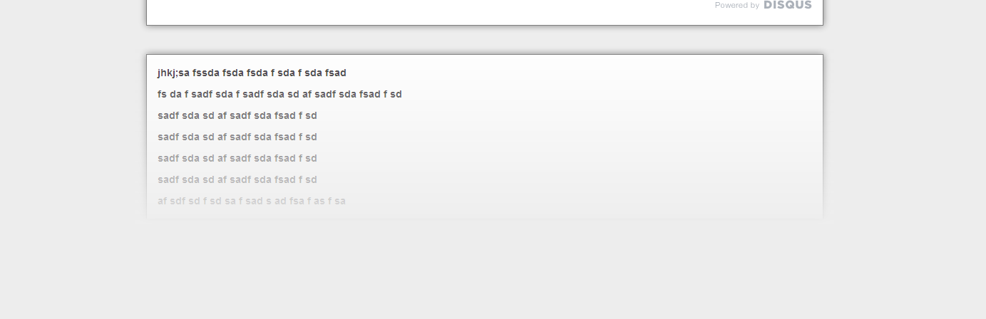
I am trying to get a div (and its border and contents) to fade into transparency (ie solid at the top and transparent at the bottom) using css.
Is there a way to do this?
Ive been able to fade the background out with the following:
.fade-to-nothing
{
    background-image: -moz-linear-gradient(top, rgba(255,255,255,1), rgba(255,255,255,0));
    background-image: -webkit-gradient(linear, 0 0, 0 100%, from(rgba(255,255,255,1)), to(rgba(255,255,255,0)));
    background-image: -webkit-linear-gradient(top, rgba(255,255,255,1), rgba(255,255,255,0));
    background-image: -o-linear-gradient(top, rgba(255,255,255,1), rgba(255,255,255,0));
    background-image: linear-gradient(to bottom, rgba(255,255,255,1),rgba(255,255,255,0));
    background-repeat: repeat-x;
}
but haven't been able to find a way to do it to the content/border of the div as well. perhaps with some kind of nesting or an overlay?
EDIT heres what I was trying to do:
Answer

Quoting from my answer here:
Check this working demo, and try to add/remove contents from #contents
HTML
<div id="container">
    <div id="contents">
        Some contents goes here
    </div>
    <div id="gradient">
    </div>
</div>
CSS
#container {
    position:relative;
}
#contents {
    background:red;
}
#gradient {
    position:absolute;
    z-index:2;
    right:0; bottom:0; left:0;
    height:200px; /* adjust it to your needs */
    background: url(data:image/svg+xml;base64,alotofcodehere);
    background: -moz-linear-gradient(top,  rgba(255,255,255,0) 0%, rgba(255,255,255,1) 70%);
    background: -webkit-gradient(linear, left top, left bottom, color-stop(0%,rgba(255,255,255,0)), color-stop(70%,rgba(255,255,255,1)));
    background: -webkit-linear-gradient(top,  rgba(255,255,255,0) 0%,rgba(255,255,255,1) 70%);
    background: -o-linear-gradient(top,  rgba(255,255,255,0) 0%,rgba(255,255,255,1) 70%);
    background: -ms-linear-gradient(top,  rgba(255,255,255,0) 0%,rgba(255,255,255,1) 70%);
    background: linear-gradient(to bottom,  rgba(255,255,255,0) 0%,rgba(255,255,255,1) 70%);
}​
This will work almost in any browser which supports opacity (including IE9), and here's the IE8 "rgba" fallback (untested):
filter: progid:DXImageTransform.Microsoft.gradient( startColorstr='#00ffffff', endColorstr='#ffffff',GradientType=0 );
To generate your own gradient, visit Colorzilla.
The first stop (0%) must have opacity 0 ( rgba(255,255,255,0); ), then around 70% - do some tests to find what's good for you - add another stop with opacity 1 ( rgba(255,255,255,1); ).