CSS: Placing divs left/center/right inside header

I've been trying to create a site with the following structure:
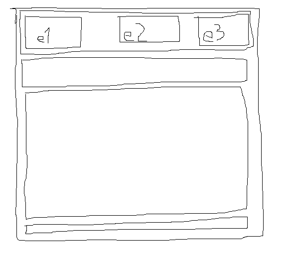
But I can't seem to get the header correct (e1 left, e2 centered, e3 right). I want the three elements e1, e2 and e3 to be left, middle and right positioned. This is what I'm trying:
<div id="wrapper">
<div id="header">
    <div id="header-e1">
        1
    </div>
    <div id="header-e2">
        2
    </div>
    <div id="header-e3">
        3
    </div>
</div>
<div id="nav">
    links
</div>
<div id="content">
    content
</div>
<div id="footer">
    footer
</div>
</div>
With this css:
#wrapper
{
    width: 95%;
    margin: 20px auto;
    border: 1px solid black;
}

#header
{
    margin: 5px;
}
#header-e1
{
    float: left;
    border: 1px solid black;
}
#header-e2
{
    float: left;
    border: 1px solid black;
}
#header-e3
{

    border: 1px solid black;
}

#nav
{
    margin: 5px;
}
#content
{
    margin: 5px;
}
#footer
{
    margin: 5px;
}
Can someone give me tips to what I can do? The structure is going to be used on a mobile website.
UPDATE
The code I have above gives me this:
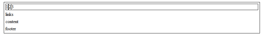 But I want the 2 centered and the 3 on the right side. I don't want to set the width to a percent because the content in the elements may vary, meaning it may be 20/60/20 - 10/80/10 - 33/33/33 or something else.
Answer

Utilize the Magic of Overflow: Hidden
If you can swap the html position of 2 & 3 like so:
<div id="header-e1">
    1 is wider
</div>
<div id="header-e3">
    3 is also
</div>
<div id="header-e2">
    2 conforms
</div>
Then you can set this css which will cause 2 to "fill" the available space because of the overlow: hidden on it. So if 1 & 3 expand, 2 narrows (shrink window down to see what happens at really small size).
#header-e1 {float: left;}
#header-e2 {overflow: hidden;}
#header-e3 {float: right;}
Technically, you could keep your current html order and your float: left on both 1 & 2 and make 3 the flex div with overflow: hidden. You could do the same with 1 by reversing the order of the html completely and setting 2 & 3 to float: right with 1 having overflow: hidden. To me it would seem best to have the middle flex, but you know your application better than I.