How do overlap in Xamarin forms?

Does the concept of z-index?
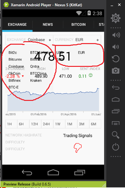
The picture shows that there is no overlap.
 How to set z-index?
the top two custom select box
How to set z-index?
the top two custom select box
<AbsoluteLayout Padding="10,10,10,10" VerticalOptions="FillAndExpand">

    <ui:BoxSelector x:Name="selectorExchangs"
                    AbsoluteLayout.LayoutBounds="0,0,0.5,0.3"
                    AbsoluteLayout.LayoutFlags="All"
                    BackgroundColor="Transparent"
                    CommandAfterChanged="{Binding ExchangesAfterChangedCommand}"
                    Items="{Binding ExchangesList}"
                    LabelPath="Name"
                    PanelColor="#f9f9f9"
                    SelectedItem="{Binding SelectedExchange}"
                    SelectorLabel="EXCHANGE" />

    <ui:BoxSelector AbsoluteLayout.LayoutBounds="1,0,0.5,0.3"
                    AbsoluteLayout.LayoutFlags="All"
                    BackgroundColor="Transparent"
                    CommandAfterChanged="{Binding TradingPairAfterChangedCommand}"
                    Items="{Binding AvailableTradinPairsList}"
                    LabelPath="PriceCurrencyName"
                    PanelColor="#f9f9f9"
                    SelectedItem="{Binding SelectedTraingPair}"
                    SelectorLabel="CURRENCY" />
And all the rest. Chart, data, e.t.c
<StackLayout AbsoluteLayout.LayoutBounds="1,1,1,0.9" AbsoluteLayout.LayoutFlags="All">...</StackLayout>
BoxSelector.xaml(content view), Reusable ContentView extends
<ContentView.Resources>
    <ResourceDictionary x:Name="AppDictionary">
        <Color x:Key="BackgroundColor">#f9f9f9</Color>
        <Color x:Key="BorderColor">#e2e2e2</Color>
        <Style x:Key="InternalViewStyle" TargetType="ContentView">
            <Setter Property="BackgroundColor" Value="{StaticResource BackgroundColor}" />
            <Setter Property="VerticalOptions" Value="Fill" />
            <Setter Property="Padding" Value="5,5,5,5" />
        </Style>
        <Style x:Key="BorderStyle" TargetType="ContentView">
            <Setter Property="BackgroundColor" Value="{StaticResource BorderColor}" />
            <Setter Property="Padding" Value="1,1,1,1" />
        </Style>
    </ResourceDictionary>
</ContentView.Resources>

<StackLayout BindingContext="{x:Reference Name=ContentView}" HorizontalOptions="FillAndExpand">
    <ContentView BackgroundColor="#f5f5f5" HorizontalOptions="FillAndExpand">
        <StackLayout>
            <ContentView Style="{StaticResource BorderStyle}">
                <ContentView Style="{StaticResource InternalViewStyle}">
                    <StackLayout Orientation="Horizontal">
                        <StackLayout x:Name="selectorBox"
                                     BackgroundColor="{Binding PanelColor}"
                                     HorizontalOptions="FillAndExpand"
                                     Orientation="Horizontal">
                            <StackLayout HorizontalOptions="StartAndExpand" Orientation="Horizontal">
                                <Label FontSize="12"
                                       HorizontalOptions="FillAndExpand"
                                       Text="{Binding SelectorLabel}"
                                       TextColor="#cccccc" />
                                <Label x:Name="valueLabe"
                                       BackgroundColor="{Binding PanelColor}"
                                       FontSize="13"
                                       HorizontalOptions="FillAndExpand"
                                       Text="Choose"
                                       TextColor="#313131" />
                            </StackLayout>
                            <StackLayout HorizontalOptions="EndAndExpand">
                                <Label Text="+" TextColor="#313131" />
                            </StackLayout>
                        </StackLayout>
                    </StackLayout>
                </ContentView>
            </ContentView>

            <Grid x:Name="boxSelectorGrid"
                  BackgroundColor="#f5f5f5"
                  Padding="10,10,10,10">
                <Grid.ColumnDefinitions>
                    <ColumnDefinition Width="*" />
                    <ColumnDefinition Width="*" />
                </Grid.ColumnDefinitions>
                <Grid.RowDefinitions>
                    <RowDefinition Height="Auto" />
                </Grid.RowDefinitions>
            </Grid>

        </StackLayout>
    </ContentView>
</StackLayout>
Answer

Z-Index is established by the ordering of the Child elements in a container element. The first child is at the back of the Z stack, the second child is placed above it, and so on.
The layout container you are using will dictate how each child is positioned. A StackLayout will not allow overlaps. AbsoluteLayout and RelativeLayout will allow overlaps easily. A Grid will allow overlap for elements that extend into the same row and column. None of these have an appearance of their own (think of them as transparent boxes by default). If you want them to occlude the content behind them, then you will need to assign a background color or image, else they will just be painted right on top of the other content.