How to change background color of TabControl.Header

I need to change the background color of the TabControl header, but TabControl haven't property for it, how can I do it. Help me please. Here is my code:
<Window x:Class="WpfApplication1.MainWindow"
        xmlns="http://schemas.microsoft.com/winfx/2006/xaml/presentation"
        xmlns:x="http://schemas.microsoft.com/winfx/2006/xaml"
        Title="MainWindow" Height="502" Width="628">
    <TabControl Background="#123" TabStripPlacement="Left" HorizontalAlignment="Stretch" BorderBrush="#41020202">
        <TabControl.BitmapEffect>
            <DropShadowBitmapEffect Color="Black" Direction="270"/>
        </TabControl.BitmapEffect>
        <TabControl.Resources>
            <Style TargetType="{x:Type TabItem}">
                <Setter Property="BorderThickness" Value="0"/>
                <Setter Property="Padding" Value="0" />
                <Setter Property="HeaderTemplate">
                    <Setter.Value>
                        <DataTemplate>
                            <Border x:Name="grid" Background="Red">
                                <ContentPresenter>
                                    <ContentPresenter.Content>
                                        <TextBlock Margin="4" FontSize="15" Text="{TemplateBinding Content}"/>
                                    </ContentPresenter.Content>
                                    <ContentPresenter.LayoutTransform>
                                        <RotateTransform Angle="270" />
                                    </ContentPresenter.LayoutTransform>
                                </ContentPresenter>
                            </Border>
                            <DataTemplate.Triggers>
                                <DataTrigger Binding="{Binding RelativeSource={RelativeSource Mode=FindAncestor,AncestorType={x:Type TabItem}},Path=IsSelected}" Value="True">
                                    <Setter TargetName="grid" Property="Background" Value="Green"/>
                                </DataTrigger>
                            </DataTemplate.Triggers>
                        </DataTemplate>
                    </Setter.Value>
                </Setter>
            </Style>
        </TabControl.Resources>
        <TabItem Header="Tab Item 1" />
        <TabItem Header="Tab Item 2" />
        <TabItem Header="Tab Item 3" />
        <TabItem Header="Tab Item 4" />
    </TabControl>
</Window>
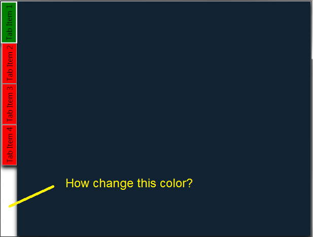
Here is my result:
Here is result that I need:

Answer

Adding the following style in the TabControl.Resources section should do what you want.
<Style TargetType="{x:Type TabPanel}">
    <Setter Property="Background" Value="Black"></Setter>
</Style>