How to lazy load a Bootstrap 4 card's image?

Im trying to figure out how to lazy load card-columns with card-img-top, example:
<div class="card-columns">
    <div class="card text-center">
        <img class="card-img-top lazy" src="img/foo.jpg" alt="foo" />
        <div class="card-body">
            <!-- more code -->
        </div>
    </div>
</div>
My research
Searching through the tag bootstrap-4 and bootstrap I found "How to animate Bootstrap 4 cards one by one?" but that is for animations on the cards without an image loading.
"Bootstrap-carousel lazy loader" is for Bootstrap 3.
Searching in Bootstrap's documentation the only loading result I'm able to return is for Spinners.
Searching further under the tag bootstrap-4 I was able to locate "Bootstrap carousel Images not showing" but that is focused on the carousel and not cards.
After trying to lazy load with lazyload using the recipe Responsive images I omitted the data-srcset & data-sizes:
However one issue I still face is the images are responsive so I found "Lazy loading with “responsive” images (unknown height)" but conflicts with what I'm trying to do.
The Q&A "Lazy loading images how" did appear when writing the question but it's from 2010 and surely there's a better approach.
The Question
In Bootstrap 4.2 how can I lazy load images for a card that will render the appropriate height and width of the responsive image but load on scroll? Does Bootstrap 4 have a built in way to lazy load images that I'm missing? My tests are being performed in Chrome on a Slow 3G network.
If I'm miss-informed or my approach is wrong please educate me I haven't played with lazy loading before.
After answer
I've modified the HTML after referencing:
<img class="card-img-top lazyload" src="img/foo.jpg" data-src="img/foo.jpg" data-original="img/foo.jpg 480w, img/foo.jpg 640w, img/foo.jpg 1024w" alt="foo" width="765" height="auto" lazyload="on" />
<img class="card-img-top lazyload" src="img/bar.jpg" data-src="img/bar.jpg" data-original="img/bar.jpg 480w, img/bar.jpg 640w, img/bar.jpg 1024w" alt="fire" width="765" height="auto" lazyload="on" />
Script called:
<script src="https://cdn.jsdelivr.net/npm/[email protected]/lazyload.js"></script>
<script>$("img .lazyload").lazyload();</script>
Chrome Network shows:
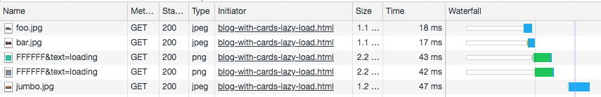
lazy load was also added to FFFFFF&text=loading so the first image that should have loaded would have been jumbo.jpg.
Comment Request
Per request a Bootply of what I've tried demoing the code. Haven't used Bootply but per research to run JavaScript I should just place it in <script> tags per here so that is what I've done in the Bootply.
Answer

Use the JS lazy load plugin, it is quite complete and intuitive.
Example:
https://imagekit.io/blog/lazy-loading-images-complete-guide/
URL plugin
https://github.com/tuupola/jquery_lazyload
HTML
<!-- Begin Body -->
<div class="container-fluid" id="main">
    <div class="row">

            <div class="col-md-12">
                <h2>Image Grid with Lazy Loading Images</h2>
                <p class="lead">Images will load as you scroll down</p>
                <hr>
            </div>
            <div class="col-sm-6">
                <div class="panel panel-default">
                    <div class="panel-body"><img data-original="/assets/templates/tmp_129821.png" class="img-responsive"></div>
                </div>
            </div>
            <div class="col-sm-6">
                <div class="panel panel-default">
                    <div class="panel-body"><img data-original="/assets/templates/tmp_128936.png" class="img-responsive"></div>
                </div>
            </div>
            <div class="col-sm-6">
                <div class="panel panel-default">
                    <div class="panel-body"><img data-original="/assets/templates/101004.png" class="img-responsive"></div>
                </div>
            </div>
            <div class="col-sm-6">
                <div class="panel panel-default">
                    <div class="panel-body"><img data-original="/assets/templates/100993.png" class="img-responsive"></div>
                </div>
            </div>
        </div><!--/row-->
    </div>
</div>
JS
$('#main .img-responsive').lazyload();