Styling the asp.net charting controls
Using the ASP.Net Chart Controls, which are a subset of the Dundas Chart Controls,
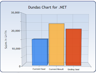
How can I make charts that look like this:

Instead of this:

EDIT: I've made some progress, since asking this question. The styling elements that improve the default graph in both Dundas and MSChart are:
- Round Corners on the chart container
- Background colours and gradients on chart container
- Transparency on column colours
- Alignment of columns in the x axis (bizarely, MSChart defaults to z axis alignment)
- Area 3D wall width
Answer
I know it's a bit late, but I was playing with the chart for a project I'm working on.
Color="#960080ff"
The first set of two digits in the color are for the alpha channel. I've got it set for 96 which is semi transparent.
enjoy