Changing the background color of a Tab in TabLayout (Android design support library) doesn't occupy the entire tab space

I have a TabLayout (design support library) which is tied up to a ViewPager containing three tabs. I have designed a custom layout and set that to each tab in the TabLayout. I have been trying to change the background color of the currently selected tab. The color only wraps up around the text in the tab but doesn't occupy the entire tab space.
Below are the code snippets of my activity and the custom layout file.
Activity code
public class CustomTabLayoutActivity extends AppCompatActivity {

private TabLayout tabLayout;

@Override
protected void onCreate(Bundle savedInstanceState) {
    super.onCreate(savedInstanceState);
    setContentView(R.layout.activity_custom_tab_layout);
    tabLayout = (TabLayout) findViewById(R.id.tabLayout);
    ViewPager viewPager = (ViewPager) findViewById(R.id.viewPager);
    setupViewPager(viewPager);
    tabLayout.setupWithViewPager(viewPager);
    tabLayout.setTabMode(TabLayout.MODE_SCROLLABLE);
    setupTabLayout();
    viewPager.setCurrentItem(0);
    viewPager.addOnPageChangeListener(new ViewPager.OnPageChangeListener() {
        @Override
        public void onPageScrolled(int position, float positionOffset, int positionOffsetPixels) {

        }

        @Override
        public void onPageSelected(int position) {
            for (int i = 0; i < tabLayout.getTabCount(); i++) {
                if (i == position) {
                    tabLayout.getTabAt(i).getCustomView().setBackgroundColor(Color.parseColor("#198C19"));
                } else {
                    tabLayout.getTabAt(i).getCustomView().setBackgroundColor(Color.parseColor("#f4f4f4"));
                }
            }
        }

        @Override
        public void onPageScrollStateChanged(int state) {
        }
    });
}


private void setupViewPager(ViewPager viewPager) {
    CustomViewPagerAdapter pagerAdapter = new CustomViewPagerAdapter(getSupportFragmentManager());
    pagerAdapter.addFragments(new OneFragment(), "ONE");
    pagerAdapter.addFragments(new OneFragment(), "TWO");
    pagerAdapter.addFragments(new OneFragment(), "THREE");
    viewPager.setAdapter(pagerAdapter);
}

private void setupTabLayout() {

    TextView customTab1 = (TextView) LayoutInflater.from(CustomTabLayoutActivity.this)
            .inflate(R.layout.custom_tab_layout, null);
    TextView customTab2 = (TextView) LayoutInflater.from(CustomTabLayoutActivity.this)
            .inflate(R.layout.custom_tab_layout, null);
    TextView customTab3 = (TextView) LayoutInflater.from(CustomTabLayoutActivity.this)
            .inflate(R.layout.custom_tab_layout, null);
    customTab1.setText("ONE");
    tabLayout.getTabAt(0).setCustomView(customTab1);
    customTab2.setText("TWO");
    tabLayout.getTabAt(1).setCustomView(customTab2);
    customTab3.setText("THREE");
    tabLayout.getTabAt(2).setCustomView(customTab3);
}
}
Custom Layout file for each tab
<?xml version="1.0" encoding="utf-8"?>
<TextView xmlns:android="http://schemas.android.com/apk/res/android"
   android:id="@+id/tab"
   android:layout_width="match_parent"
   android:layout_height="match_parent"
   android:layout_gravity="center"
   android:background="#ffffff"
   android:text="Test"
   android:textColor="@android:color/black"
   android:textSize="20sp" />
Here is the screenshot of the tabs after running the above code.

As you guys can see, the color only occupies the text in the tab but not the entire tab space. How to achieve this? Any ideas/suggestions would help me a lot. Thanks in advance.
Answer

Define a selector as a drawable, and also have a drawable for the selected/unselected states.
For this solution, I started with the code from this answer, and then added the functionality that changes the background color for the current Tab.
First, the selector, tab_background.xml in the drawable folder:
<?xml version="1.0" encoding="utf-8"?>
<selector xmlns:android="http://schemas.android.com/apk/res/android">
    <item android:drawable="@drawable/tab_background_selected" android:state_selected="true" />
    <item android:drawable="@drawable/tab_background_unselected" android:state_selected="false" android:state_focused="false" android:state_pressed="false" />
</selector>
Then, tab_background_selected.xml in the drawable folder:
<?xml version="1.0" encoding="utf-8"?>
<shape xmlns:android="http://schemas.android.com/apk/res/android" >
    <solid android:color="#d13fdd1a" />
</shape>
Then, tab_background_unselected.xml in the drawable folder:
<?xml version="1.0" encoding="utf-8"?>
<shape xmlns:android="http://schemas.android.com/apk/res/android" >
    <solid android:color="#3F51B5" />
</shape>
Finally, in your styles.xml, specify the selector to use, and also specify the tab indicator style, since the app:tabIndicatorColor property in the TabLayout will now be ignored:
<style name="Base.Widget.Design.TabLayout" parent="android:Widget">
    <item name="tabBackground">@drawable/tab_background</item>
    <item name="tabIndicatorColor">#ff00ff</item>
    <item name="tabIndicatorHeight">2dp</item>
</style>
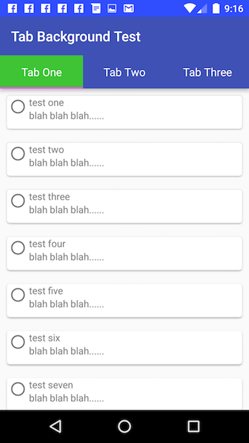
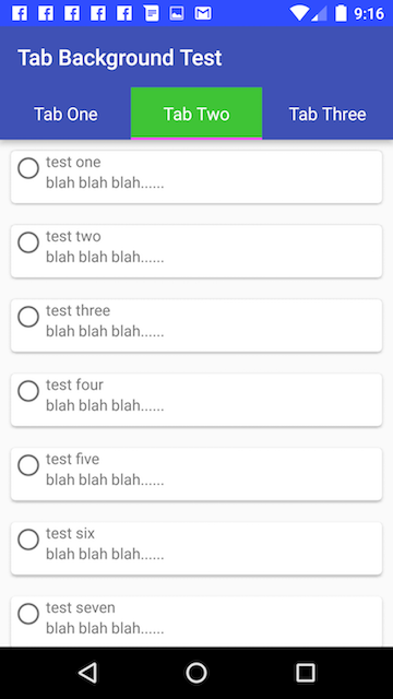
Result with the example colors above:
Additional Note:
Tested with the 23.3.0 versions of the support library components:
dependencies {
    compile 'com.android.support:appcompat-v7:23.3.0'
    compile 'com.android.support:cardview-v7:23.3.0'
    compile 'com.android.support:recyclerview-v7:23.3.0'
    compile 'com.android.support:design:23.3.0'
    compile 'com.android.support:support-v4:23.3.0'
}