Android v21 Theme.Appcompat color accent is ignored, no padding on dialogs

I'm using ActionBarActivity from the Android 5 SDK and here is my theme.xml for v21
<style name="AppTheme_Light" parent="Theme.AppCompat.Light.DarkActionBar">
    <item name="android:colorPrimary">@color/abc1</item>
    <item name="android:colorPrimaryDark">@color/abc2</item>
    <item name="android:colorAccent">@color/abc3</item>
</style>
But the colors are ignored, and are replaced by a default teal color and all the dialogs appear without padding.
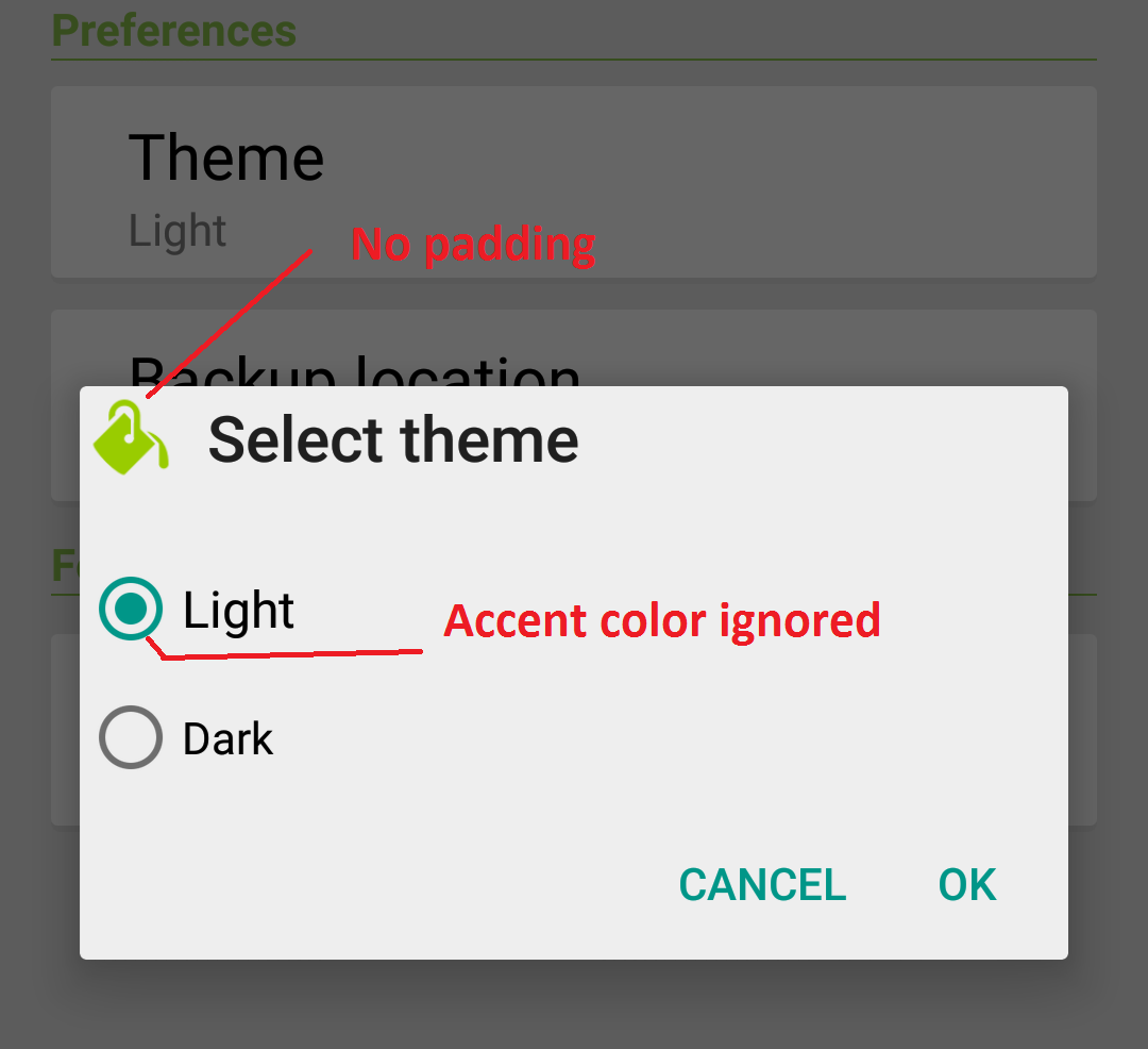
Also, padding is also ignored in other places like custom toast, problem only occurs in lollipop devices.
Edit:
The padding problem was due to fitsSystemWindow and I got it fixed using
this question..
But the accent color problem is still there, and it does not just affect dialogs but the whole app.
Answer

About the accent color. You are using a AppCompat theme so you should remove Android from the namespace inside your theme.
<style name="AppTheme_Light" parent="Theme.AppCompat.Light.DarkActionBar">
    <item name="colorPrimary">@color/abc1</item>
    <item name="colorPrimaryDark">@color/abc2</item>
    <item name="colorAccent">@color/abc3</item>
</style>
About the dialog. AppCompat doesn't support it (as I know).
You can try to use this style in your values-v21 folder:
<style name="Theme" parent="FrameworkRoot.Theme">
    <item name="android:alertDialogTheme">@style/Theme.AlertDialog</item>
</style>

<style name="Theme.AlertDialog" parent="android:Theme.Material.Light.Dialog.Alert">
    <item name="android:colorPrimary">@color/demo_primary_color</item>
    <item name="android:colorPrimaryDark">@color/demo_colorPrimaryDark</item>
    <item name="android:colorAccent">@color/theme_accent_1</item>
</style>
UPDATE 23/04/2015: SUPPORT LIBRARY V.22.1
The new support library v22.1 works with the Dialog.
You can use an android.support.v7.app.AlertDialog or the new AppCompatDialog.
For example:
import android.support.v7.app.AlertDialog

AlertDialog.Builder builder =
       new AlertDialog.Builder(this, R.style.AppCompatAlertDialogStyle);
            builder.setTitle("Dialog");
            builder.setMessage("Lorem ipsum dolor ....");
            builder.setPositiveButton("OK", null);
            builder.setNegativeButton("Cancel", null);
            builder.show();
And use a style like this:
<style name="AppCompatAlertDialogStyle" parent="Theme.AppCompat.Light.Dialog.Alert">
    <item name="colorAccent">#FFCC00</item>
    <item name="android:textColorPrimary">#FFFFFF</item>
    <item name="android:background">#5fa3d0</item>
</style>
Otherwise you can define in your current theme:
<style name="AppTheme" parent="Theme.AppCompat.Light">
    <!-- your style -->
    <item name="alertDialogTheme">@style/AppCompatAlertDialogStyle</item>
</style>
and then in your code:
 import android.support.v7.app.AlertDialog

    AlertDialog.Builder builder =
           new AlertDialog.Builder(this);